The Confirmation Dialog I Got Tired of Rebuilding
How I built a reusable confirmation system with Zustand that works anywhere in the app without prop drilling or repeated code.
by Akinur Rahman
23/02/2026
The Confirmation Dialog I Got Tired of Rebuilding
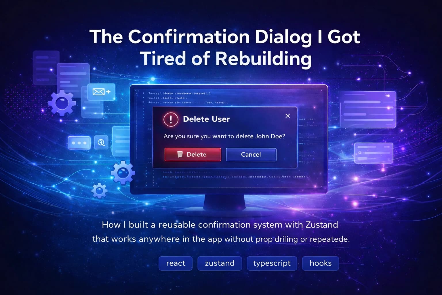
Every admin app I've built has the same flow. User clicks delete. A dialog pops up asking "are you sure?". User confirms. The thing gets deleted.
Simple. Except the way most people implement it is anything but.
The Problem
The obvious way to do this is to put the dialog in the component that triggers it:
function UserRow({ user }: { user: User }) {
  const [open, setOpen] = useState(false);
  const [loading, setLoading] = useState(false);

  const handleDelete = async () => {
    setLoading(true);
    await deleteUser(user.id);
    setLoading(false);
    setOpen(false);
  };

  return (
    <>
      <Button onClick={() => setOpen(true)}>Delete</Button>
      <AlertDialog open={open} onOpenChange={setOpen}>
        <AlertDialogContent>
          <AlertDialogHeader>
            <AlertDialogTitle>Delete User</AlertDialogTitle>
            <AlertDialogDescription>
              Are you sure you want to delete {user.name}?
            </AlertDialogDescription>
          </AlertDialogHeader>
          <AlertDialogFooter>
            <AlertDialogCancel disabled={loading}>Cancel</AlertDialogCancel>
            <Button onClick={handleDelete} disabled={loading}>
              {loading ? 'Deleting...' : 'Delete'}
            </Button>
          </AlertDialogFooter>
        </AlertDialogContent>
      </AlertDialog>
    </>
  );
}
That is about 40 lines for one delete button. And you do this for every table row, every form, every action that needs a confirmation.
Then your PM says some confirmations should be warnings, not destructive. So now you need a variant prop. Then design says the loading state should show a spinner. Then someone wants a custom confirm button text for one specific action.
Before long you have a slightly different version of this in 15 places across the app. Each one handles loading slightly differently. Some have the spinner, some don't. One still has a bug where the dialog stays open if the request fails.
I got tired of it.
What I Built
The idea is simple. One dialog component mounted once at the root of the app. A Zustand store that any component can call to open it. No local state, no prop drilling, no repeated JSX.
The store is the core of it:
type ConfirmationState = {
  open: boolean;
  loading: boolean;
  config: ConfirmationConfig<unknown> | null;
  openConfirmation: (config: ConfirmationConfig<unknown>) => void;
  closeConfirmation: () => void;
  setLoading: (loading: boolean) => void;
};

export const useConfirmationStore = create<ConfirmationState>(set => ({
  open: false,
  loading: false,
  config: null,
  openConfirmation: config => set({ open: true, loading: false, config }),
  closeConfirmation: () => set({ open: false, loading: false, config: null }),
  setLoading: loading => set({ loading }),
}));
The config type carries everything the dialog needs, including the item being acted on and the callback to run when confirmed:
export type ConfirmationConfig<T> = {
  title: string;
  description: string | ((item: T) => ReactNode);
  variant?: ConfirmationVariant;
  item: T;
  confirmText?: string;
  cancelText?: string;
  onConfirm: (item: T) => Promise<void> | void;
};
The item: T part is important. Instead of closing over the item in the callback, you pass it in and get it back in onConfirm. This keeps things explicit and makes the types work cleanly.
The Dialog
The dialog reads from the store and handles everything in one place — loading state, variants, the confirm handler:
export function ConfirmationDialog() {
  const { open, config, loading, closeConfirmation, setLoading } = useConfirmationStore();

  if (!config) return null;

  const { title, description, item, onConfirm, variant = 'delete', confirmText, cancelText } = config;
  const variantConfig = VARIANT_CONFIG[variant];
  const Icon = variantConfig.icon;
  const resolvedDescription = typeof description === 'function' ? description(item) : description;

  const handleConfirm = async () => {
    try {
      setLoading(true);
      await onConfirm(item);
      closeConfirmation();
    } finally {
      setLoading(false);
    }
  };

  return (
    <AlertDialog open={open} onOpenChange={loading ? () => {} : closeConfirmation}>
      <AlertDialogContent>
        <AlertDialogHeader>
          <AlertDialogTitle className="flex items-center gap-2">
            <Icon size={20} className={variantConfig.iconColor} />
            {title}
          </AlertDialogTitle>
          <AlertDialogDescription>{resolvedDescription}</AlertDialogDescription>
        </AlertDialogHeader>
        <AlertDialogFooter>
          <AlertDialogCancel disabled={loading}>
            {cancelText ?? variantConfig.defaultCancelText}
          </AlertDialogCancel>
          <Button onClick={handleConfirm} disabled={loading} className={variantConfig.actionButtonClassName}>
            {loading ? (
              <span className="flex items-center gap-2">
                <span className="h-4 w-4 animate-spin rounded-full border-2 border-current border-t-transparent" />
                {variantConfig.loadingText}
              </span>
            ) : (
              confirmText ?? variantConfig.defaultConfirmText
            )}
          </Button>
        </AlertDialogFooter>
      </AlertDialogContent>
    </AlertDialog>
  );
}
One thing worth pointing out: onOpenChange={loading ? () => {} : closeConfirmation}. This prevents the dialog from being closed by clicking outside or pressing Escape while a request is in progress. Small detail but it avoids partial states.
Variants
Different actions feel different. Deleting something is not the same as confirming a bulk action or warning someone about a destructive change. The variant config handles this:
export const VARIANT_CONFIG = {
  delete: {
    icon: Trash2,
    defaultConfirmText: 'Delete',
    loadingText: 'Deleting...',
    actionButtonClassName: 'bg-destructive text-destructive-foreground hover:bg-destructive/90',
    iconColor: 'text-destructive',
  },
  confirm: {
    icon: CheckCircle,
    defaultConfirmText: 'Confirm',
    loadingText: 'Confirming...',
    actionButtonClassName: 'bg-primary text-primary-foreground hover:bg-primary/90',
    iconColor: 'text-primary',
  },
  warning: {
    icon: AlertTriangle,
    defaultConfirmText: 'Proceed',
    loadingText: 'Processing...',
    actionButtonClassName: 'bg-yellow-500 text-black hover:bg-yellow-500/90',
    iconColor: 'text-yellow-500',
  },
};
Adding a new variant is just adding a new key here. Nothing else changes.
Setup
Mount the dialog once at the root of your app. The only requirement is that it sits inside your React tree:
export default function RootLayout({ children }: { children: React.ReactNode }) {
  return (
    <html lang="en">
      <body>
        {children}
        <ConfirmationDialog />
      </body>
    </html>
  );
}
After that every component in your app can call useConfirmation and it will just work.
Using It
A typed hook wraps the store and makes calling it clean:
export function useConfirmation<T>() {
  const openConfirmation = useConfirmationStore(s => s.openConfirmation);
  return {
    confirm: openConfirmation as (config: {
      item: T;
      title: string;
      description?: string | ((item: T) => string);
      onConfirm: (item: T) => Promise<void>;
      variant?: ConfirmationVariant;
    }) => void,
  };
}
And here is how a component uses it:
function UserActions({ user }: { user: User }) {
  const { confirm } = useConfirmation<User>();

  const handleDelete = () => {
    confirm({
      item: user,
      title: 'Delete User',
      description: item => `Are you sure you want to delete ${item.name}? This cannot be undone.`,
      variant: 'delete',
      onConfirm: async (user) => {
        await deleteUser(user.id);
      },
    });
  };

  return <Button onClick={handleDelete}>Delete</Button>;
}
That is the whole component. No local state. No dialog JSX. No loading logic. Just call confirm and describe what should happen.
What This Actually Solves
The delete button is now 10 lines instead of 40. Every confirmation in the app uses the same dialog, the same loading behavior, the same error handling. If I need to change how the loading spinner looks, I change it in one place and it updates everywhere.
The description accepting a function is something I use a lot. Instead of a generic "Are you sure?", you can show the actual item name:
description: item => `This will permanently delete "${item.title}". Are you sure?`
Small thing but it makes the dialogs feel a lot more intentional.
One Gotcha
The store uses ConfirmationConfig<unknown> internally because Zustand needs a concrete type. The typed hook casts it back to T when you use it. This is safe in practice since you control both ends, but TypeScript cannot verify it at the store level. If you are strict about casts you might not love it, but it is a reasonable tradeoff for the ergonomics you get.
If you are working on any kind of admin or data-heavy app and you are copying the same confirmation dialog code everywhere, this pattern is worth trying. Set it up once and never think about it again.
The full code is in my next-auth-starter repository. If you think something could be done better, a PR is more than welcome.
And if you want to talk about this or have feedback, you can find me on LinkedIn.